Client work · Marilyn’s Morsels
A clearer path
from interest to order.
Two selected findings from a real website review: make local delivery clear earlier, and give the business’s story more visible proof.
This is a short excerpt. The original Site Growth Audit contains 17 pages. These two findings show the level of detail within one section; they are not the whole audit. Your engagement’s scope is confirmed before work begins.
Source: Marilyn’s Morsels Site Growth Audit, July 26, 2026, pages 7–8. The findings describe the site at the time of that review.
Make the local-delivery reality part of the offer—not a checkout surprise.
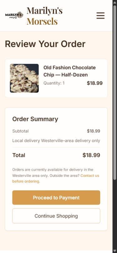
The site does explain Westerville-area delivery. The clearest version appears after a shopper has already chosen products.
Observed: checkout gives a strong local-delivery warning, and the FAQ explains the service area.
Opportunity: repeat a short, specific boundary beside the first purchase decisions.
Recommended pattern
- A slim site-wide strip: “Fresh-baked local delivery around Westerville.”
- A short delivery note beside Add to Cart.
- A link to delivery details before checkout.
- A clear fallback for event or special-location questions.
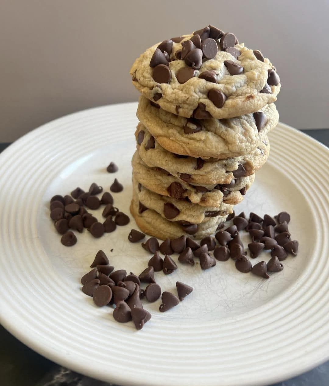
Marilyn is the brand, but the strongest proof is still offscreen.
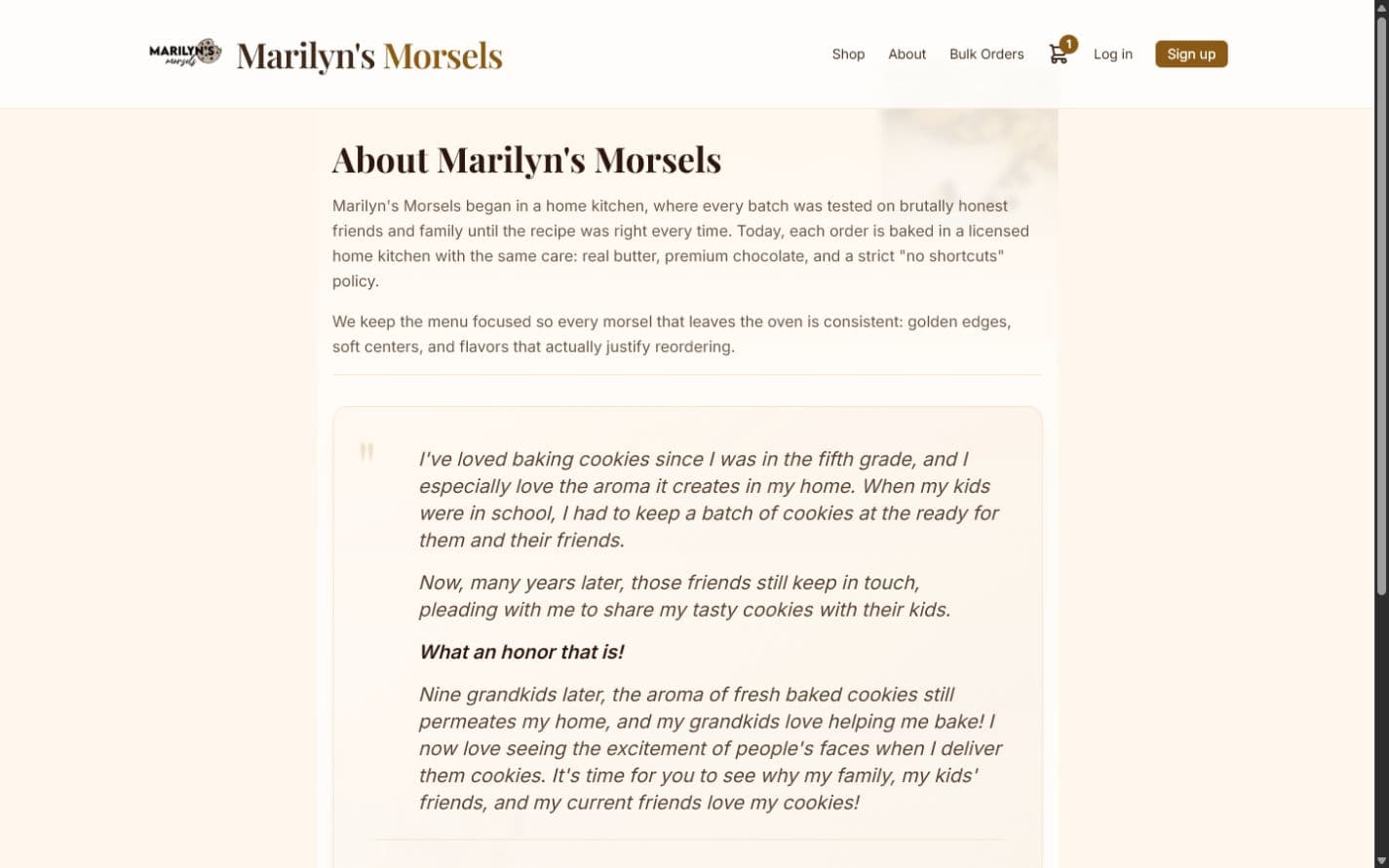
The proof stack to build
- A current portrait of Marilyn.
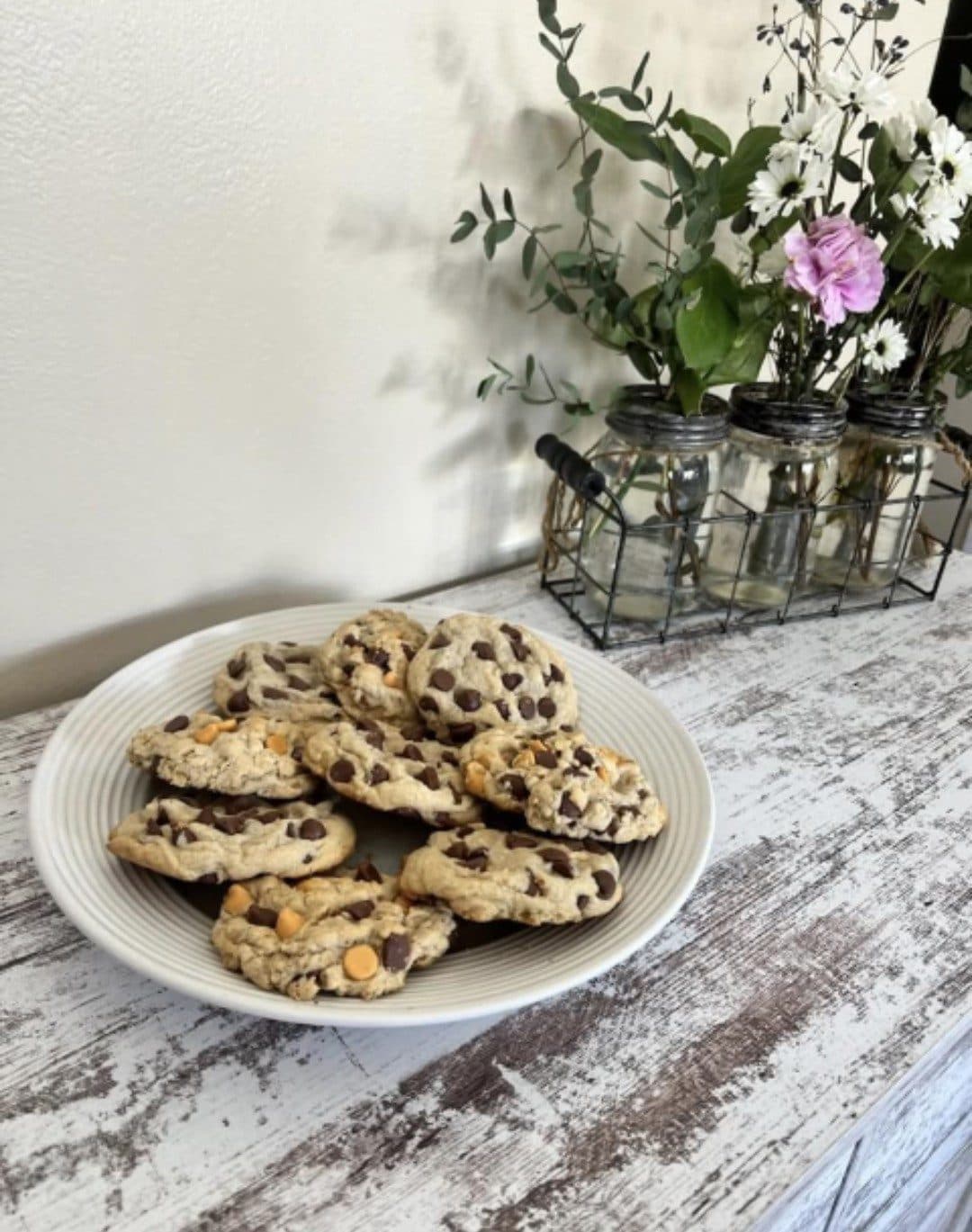
- A warm, appetizing cookie reshoot without the current gray cast.
- Distinctive branded packaging shown as part of the delivery experience.
- Real baking or kitchen-process photography.
- Authentic customer comments, only after permission.
- Event-order examples when real examples exist.
Photography and packaging are must-haves. The cookies should look warm and craveable, and the handoff should look unmistakably like Marilyn’s.
Business claims
Licensed kitchen, premium ingredients, small-batch quality.
Product evidence
Warm lighting, true golden color, texture, scale, and branded packaging.
Customer evidence
Real reactions and order contexts, published with permission.

A clear place to start
Let’s find your website’s
next useful improvement.
The audit is $100. Send your website; I’ll confirm the scope and next step by email.